SIS HvA
Redesigning the Minor Enrolment Experience
UX/UI Designer
UX Researcher
Overview
SIS HvA is the Student Information System used by students, teachers, and administrators at the Hogeschool van Amsterdam and the University of Amsterdam. It is the platform where students manage everything academic: viewing grades, checking study credits, and registering for minors, courses, and tests.
During the UX Minor at CMD, I worked with my team in the first phase to build a shared research foundation. In the individual phase that followed, I chose to focus on one of the two scenarios the client offered: redesigning the minor, course, and test registration process. The goal was to make it more intuitive, less stressful, and genuinely easier to use for students who only visit the system a handful of times a year. The final redesign was presented to SIS HvA.

My Role
UX/UI Designer &
UX Researcher
Responsibilities
UX Design
UI Design
UX Research
Team
Stakeholder’s team
(SIS HvA team, 1 client)
Duration
2 months
My Role & Responsibilities
Conducting a framework analysis of the current SIS HvA system
Developing a user persona based on group and individual research
Identifying Jobs to be Done for the primary user
Building a domain model and content model
Creating lo-fi, me-fi, and hi-fi prototypes
Running design critique sessions with peers and incorporating coach feedback across three rounds
Writing user scenarios across four moments in the enrollment timeline
Designing micro-animations and interaction patterns
Presenting the final redesign to the client
Opportunity Space
The client gave the UX team two possible directions. The first was to improve the process of registering for minors, courses, and tests. The second was a carte blanche brief: find what SIS is missing and fix it. After working on initial sketches for the carte blanche route, my first coach session made it clear that going too broad would risk creating something that duplicated existing platforms rather than improving SIS itself. That feedback pushed me firmly towards the registration scenario, where the research my team had already gathered gave me a strong foundation to build from.
The registration process matters because it only opens for a short window, often starting at 8:00 AM. Students who are slow, confused, or locked out by a technical problem can miss their chance to enrol in the minor they want. The stakes are high and the current system was not designed to help students feel calm or in control.
Problem & Key Concerns
The core problem was that enrolling in a minor at SIS HvA was stressful, confusing, and poorly timed. Several specific issues came out of the group research and my own analysis:
Students had to wait in a queue before logging in, which meant they did not know their password status until they were already waiting under pressure. Losing focus for a moment felt risky. The search function required students to know the exact minor code rather than the name, which meant newcomers often could not find what they were looking for. There was no way to save favourite minors in advance or prepare a top 3 before the deadline opened. The navigation was not ordered by the pages students actually used most. And on mobile, the interface broke down almost entirely.
Goals
Reduce the stress and confusion of the minor enrolment process
Redesign the sequence of screens so the login happens before the queue, not during it
Give students a way to save and rank their favourite minors in adance
Design a live queue tracker that works across browser tabs
Make the information architecture feel intuitive for a low-frequency user
Create a consistent set of micro-animations that give meaningful feedback at each step
Present a working prototype to the client across four different user scenarios
Discover
Understanding the system and the user
I started by analysing the current SIS HvA through the lens of the 7 Postulates framework, a model for persuasive system design. This gave me a structured way to identify where the system was falling short. The main findings were that SIS did not guide or motivate users in any meaningful way, had no incremental steps to help students through complex decisions, and was not responsive on mobile. The information quality was also inconsistent: two pages called “Results” and “Academic Progression” confused students about the difference between them.


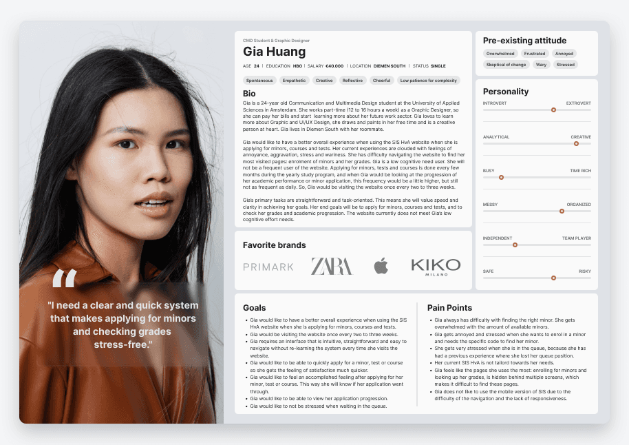
To ground the redesign in a real person, I developed a user person: Gia Huang, a 24-year-old CMD student at the HvA. Gia is what UX designers call a low cognitive need user. She visits SIS only a few times a year, so she has neither the time nor the patience to learn an entirely new system each time she opens it. The system has to be quick, intuitive, and task-oriented, especially during enrolment when she might be logging in at 8:00 AM before a full day of lectures.
Jobs to Be Done
Using the Jobs to Be Done framework, I identified eleven jobs the primary user needed to accomplish. The most important ones were: enrolling in a minor without confusion, knowing when deadlines were approaching, waiting in a queue without anxiety, finding minors by name rather than code, and feeling a real sense of confirmation after completing enrolment. These jobs directly shaped every design decision that followed.
Define
Finding the structure
Before designing a single screen, I mapped out how the system fits together. A Domain Model set out the relationships between the core parts of a Student Information System: students, academics, study programmes, the enrolment queue, and how they connect. A Content Model then went a level deeper into the content types, their attributes and their links, so the interface had a solid structure to sit on rather than a set of loose pages.

The key insight: change the order of the flow
The group's "Become the User" research had shown me the most important thing of all. Students were scared of losing their queue position while logging in. And the old order made that fear reasonable:
Before: pre-queue, queue, log in, dashboard, register. Five steps.
If you are already in the queue and then have to log in, every mistyped password feels like it might cost you your spot.
So I flipped it around:
After: log in, queue, enrolment. Three steps.
By logging students in first, the fear just goes away, because there is no queue position to lose yet. It also cut the journey to three steps, which fits the three-click rule, and it let me show students their own dashboard right after login, so they can see straight away that they are logged in and safe. One change to the order solved several of the biggest jobs at once.

Develop
A dashboard built around real behaviour
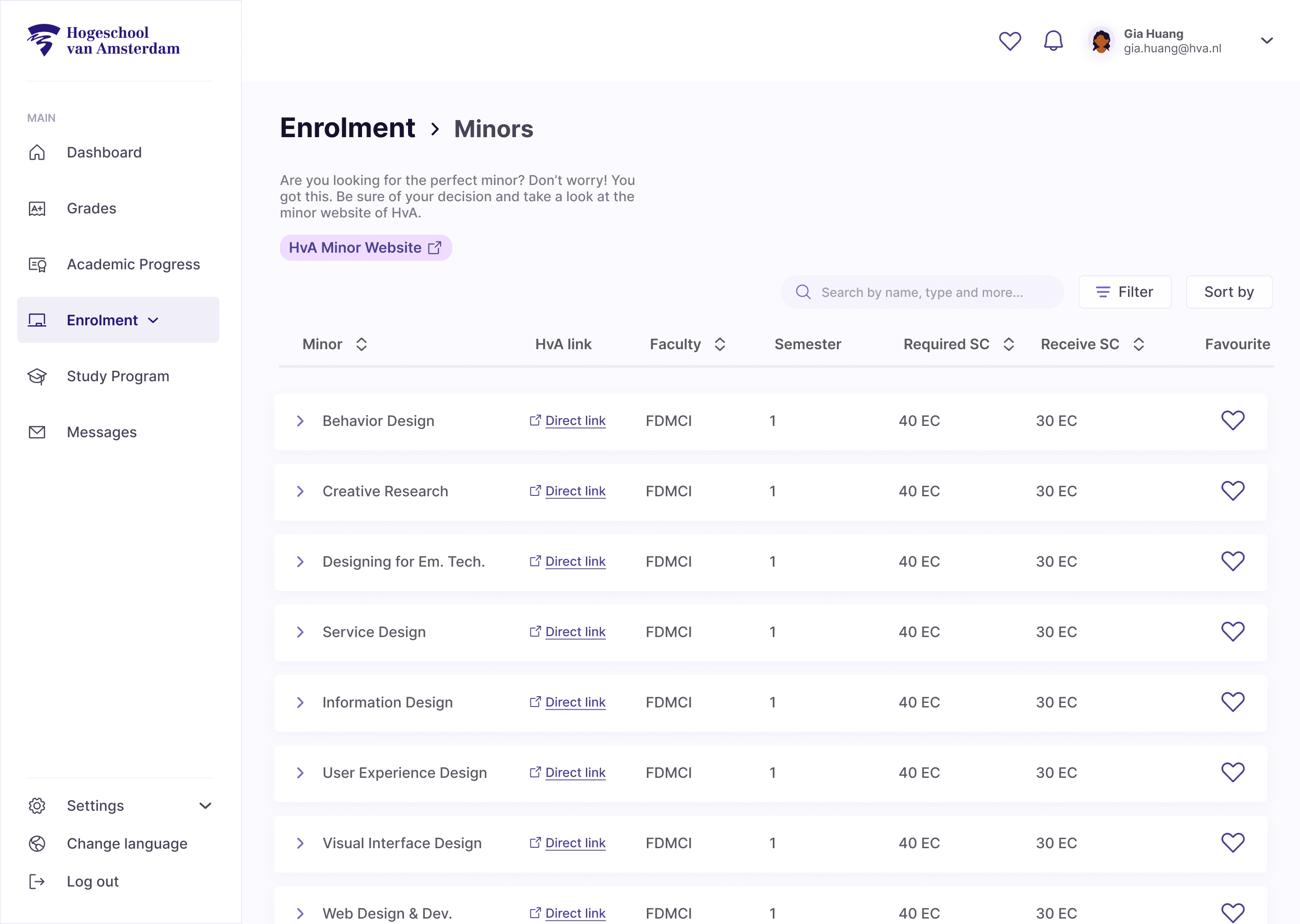
I rebuilt the navigation around how students actually use SIS, not in alphabetical order as the current SIS HvA. The vertical navigation holds the main tasks in the order people really use them (grades, academic progression, enrolment, which is the order students named in interviews). The horizontal bar holds the secondary items (favourites, notifications, profile). The dashboard opens with academic progression, the thing students come for most, so it feels personal and useful from the first second.

A queue that reassures the user
The queue was the low point emotionally, so I designed it to do the opposite of what it used to do, and keep students informed the whole time:
A progress bar with a percentage, the number of people in line, and an estimated wait, so students always know what to expect. This part went through a lot of feedback, including keeping the "number in line" for reassurance and rethinking how the percentage reads.
A reminder that you cannot lose your spot now that you are logged in.
A live notification that follows you across browser tabs, so you can check your timetable or read something in another tab and still see your queue progress, without sitting and staring.
A sound cue at around 90 percent, so you can look away completely and get called back just in time.
That last one came from modality theory (Park and Alderman, Designing Across Senses). The interface only used sight, so adding a sound makes it multimodal, which is both more accessible and less stressful, because students no longer have to hold the queue in their head.
Spreading a stressful decision across a month
Rather than making students decide everything on the morning of the deadline, I designed a favouriting system that nudges the decision earlier, when there is no pressure:
One month before, students browse and favourite minors with a heart, quietly building a shortlist.
One week before, a gentle pop-up invites them to build a Top 3 by dragging and dropping their favourites, so the hard thinking is already done. 24 hours before, they review and reassure themselves.
On the deadline, the Top 3 is already there, ready to confirm in seconds.
This is where the behavioural design comes in. It uses commitment, by getting students to lock in their choices early, and it brings the deadline-day mental load down to almost nothing. I designed the four moments as separate user scenarios and walked Gia through each one, so the flow was tested against a realistic emotional arc rather than a perfect happy path.
Search by name, and details only when you want or need them
I added search by minor name to get rid of the code-only dead end. And I used an accordion table so each minor's details (theme, credits, duration, description, redirect link and keyword tags) only open up when a student wants them. That keeps the page easy to scan for someone who does not want to work hard to read it. The keyword tags came out of coaching. They let students tell minors apart at a glance and even group them their own way.
Small animations with a clear purpose
Every animation is there for a reason, and I framed each one with the micro-interaction model (trigger, rules, feedback, loop) from UX in Motion. I also used Gestalt principles (proximity and closure) and the way our peripheral vision works to keep related controls, like a notification and its close button, visually tied together and easy to reach without hunting for them.

Deliver
Shaped by feedback
The redesign was tested and adjusted the whole way through. During the individual phase I ran three coaching reviews and two rounds of peer design critique, and I iterated after each one:
Lia, at mid fidelity, sharpened the queue feedback, the timing of the pop-ups, and the information shown for each minor. That included cutting popularity signals that would have put students off.
Michael, at high fidelity, pushed the keyword-tag idea, removed a pointless apply button, took out disabled buttons (an HCI principle from CMD), and refined the hidden favourites interaction.
Delivered to the client
I presented the final redesign to SIS HvA. It was delivered as four interactive Figma prototypes, one for each moment in the journey, a CRUDU annotation set (Create, Read, Update, Delete, Use) that documents exactly how the system responds at each interaction, and a product demo video.

Credits
Concluding thoughts
What I like most about this project is that it made me hold two things at once.
The behavioural and cognitive theory that backs up each decision, and the reality of designing inside a complex system that people have no choice but to use.
That is the kind of design problem I want to keep working on, where making something feel easy is the hardest and most rewarding part.
Services
UX Design
UI Design
UX Research
Tools
Figjam
Figma
team
Client
SIS HvA
Design
Tyneisha van Veltum

