I'mPossible Publications
Celebrating the 750th Anniversary of the City of Amsterdam
Art Direction
Brand Design
Book Design
Exhibition Design
Web Design
Web Development
Overview
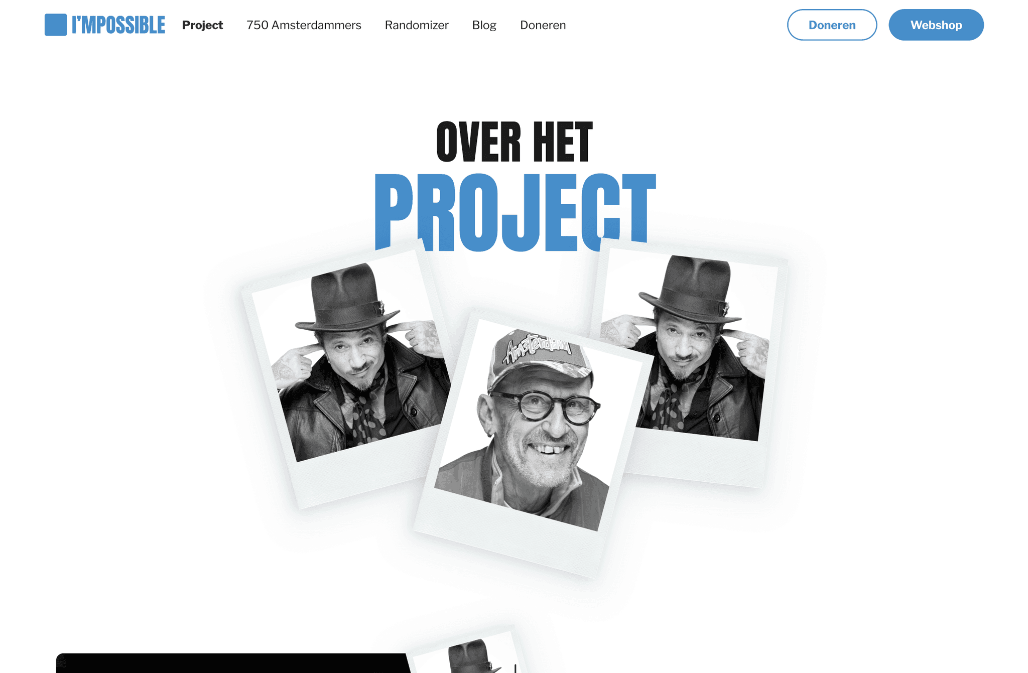
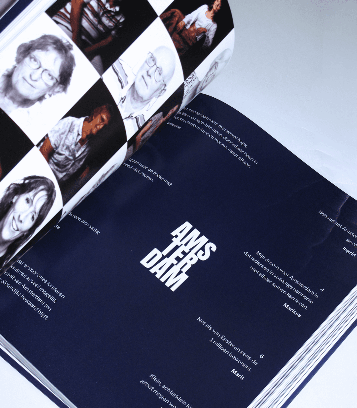
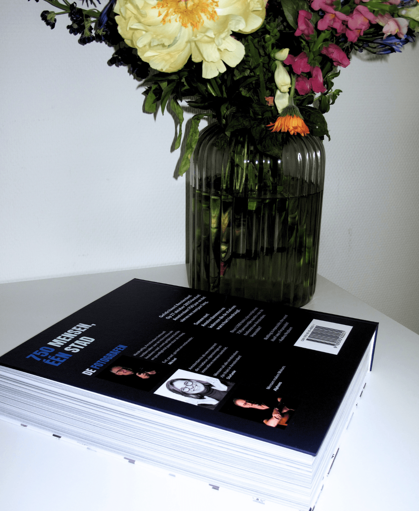
A coffee table book featuring 750 people of Amsterdam, each sharing their personal message to the city in celebration of its 750th anniversary. The book spans 600+ pages and more than 1,200 photographs in a Rembrandt-inspired style, showcasing the beauty of Amsterdam. The book and exhibition were launched at the Stadstuin of De Nederlandsche Bank. A website was also created to archive the images and drive book sales.

My Role
Responsibilities
Team
Duration
My Role & Responsibilities
I worked end-to-end on this project, from concept to the final coffee table book, exhibition, and website. My responsibilities included understanding the client’s brief, developing creative solutions, and managing the project timeline between photo delivery and the printing deadline.
I collaborated closely with the client to translate their goals into the book, the exhibition and the website.
Opportunity Space
The client was a foundation established by three photographers. They had photographed 750 Amsterdam residents and wanted to create a one-of-a-kind photography book. This meant an opportunity to establish the brand identity of the non-profit organisation I’mPossible Publications, to develop the title of the book, and to design its complete layout. The client lacked the tools to create such a book, which is why they were looking for a designer.
This opened the door to creating the photography book, the exhibition and the website for this celebratory project.
Problem & Key Concerns
Managing the project timeline: Monday, 27 October 2025 was the anniversary date marking 750 years of Amsterdam, meaning the book had to launch before this date.
The client’s photographs were not yet finalised. They needed to be edited and cropped in a specific way to convey the right message in the book.
Anticipating delays and cost overruns.
Understanding the layout requirements for a photography book, an exhibition at De Nederlandsche Bank, and a website to drive book sales.
Goals
Present the message of each of the 750 people of Amsterdam accurately in Dutch.
Place the correct image from the 1,200+ photographs for each person.
Create an index at the back of the book with the names of all photographed participants.
Design a photography book that inspires and invites people to explore.
Raise €30,000 euro to fund the project.
Deliver the book with the correct colour profile, page numbering and photo settings to the printing company.
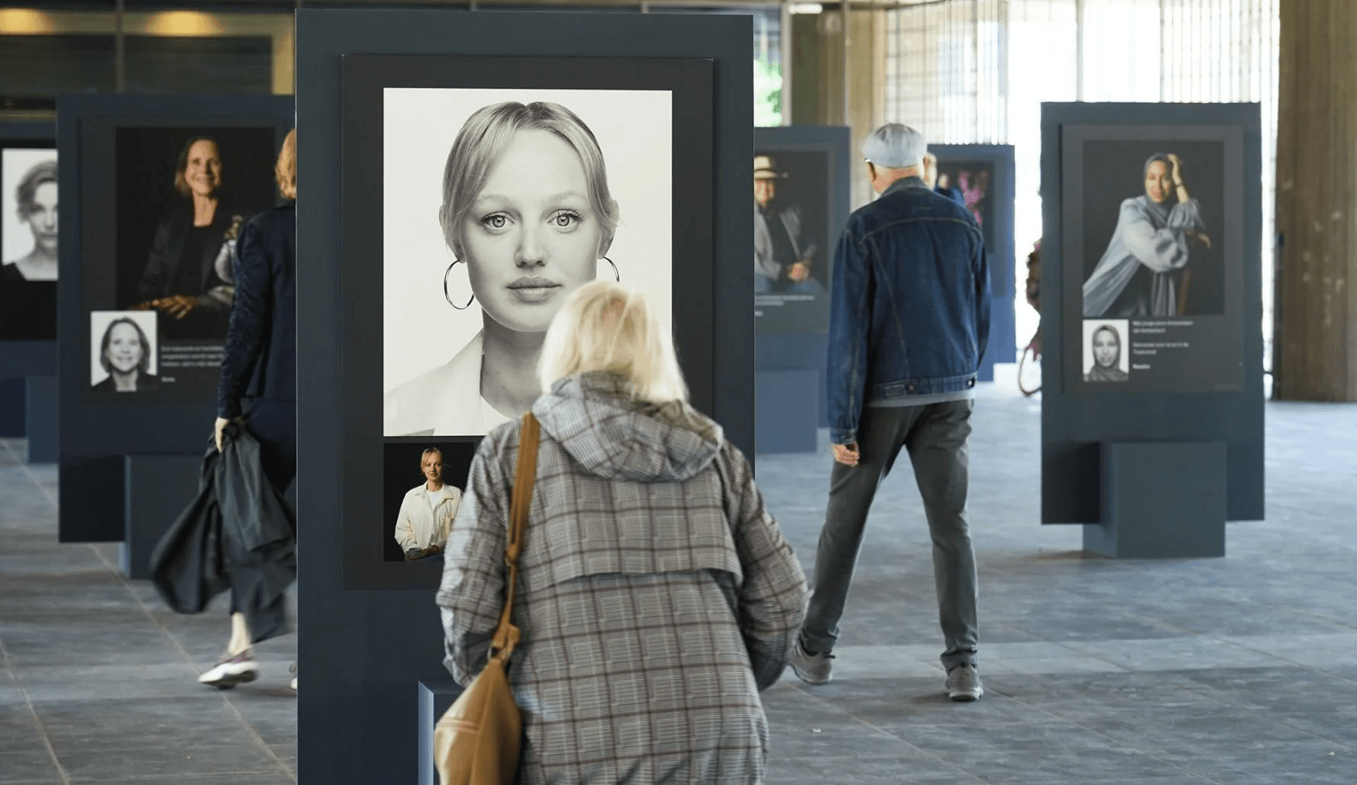
Design exhibition boards at scale featuring selected messages, ensuring a readable and user-friendly experience at the Stadstuin of De Nederlandsche Bank.
Build a website to drive book sales.
Discover & Define
Understanding the client and the project
I began by understanding the client’s brief and the philosophy behind I’mPossible Publications. I’mPossible Publications is a foundation established by three Amsterdam photographers. The name is inspired by a quote from Audrey Hepburn: “Nothing is impossible. The word itself says ‘I'm possible.’” A powerful message that runs through the entire project.


After several meetings to discuss the project, the client’s expectations, and their vision, I created a moodboard. The first board featured a lot of red, reflecting the connection between the organisation and the city of Amsterdam. It drew from the city’s existing branding and the iconic coat of arms (Andreaskruizen), with a clear and modern interpretation.
After discussing the project and documenting their pain points and potential gains, I identified key words that summarised the feelings I’mPossible Publications wanted to evoke:
Intimate
Minimalistic
Documentary
Timeless
Authentic
Emotional
Storytelling
Cinematic
Some words discussing the branding:
Monochromatic
Chiaroscuro: the technique of capturing strong contrasts between light and dark, reminiscent of Rembrandt’s paintings.
The final brand identity and the title of the book
After presenting the research and moodboard to the client, they expressed a preference for something more distinct from the current branding of the City of Amsterdam. They also wanted a royal blue integrated into the visual identity, to convey a sense of regality and authenticity to the target audience.
That is when the final colour palette was established. The blue was used throughout the book at a ratio of 20 to 30% to avoid overwhelming the reader. After finalising the branding of I’mPossible Publications, I began brainstorming possible titles for the coffee table book. In a later meeting, I presented the various options and together we decided that ‘750 Faces, One City’ perfectly captured the depth and spirit of the book.

Develop
Seeing the photographs in person and defining the book’s size and layout
To deepen my understanding of each photographer’s work, I met with them in person to view the photographs and discuss the sizing and layout of the book. They showed me photography books of various sizes and layouts that had inspired them. I asked about their reasoning and the intended length. They specified it should be around 600 to 610 pages. I also explored what additional elements they envisioned, and after our meeting, I began developing the layout.

Defining the book size and moving into low-fidelity designs
The photographers and I agreed on staggered deadlines for delivering photo batches and Excel-sheets containing each person’s quote. Whilst waiting for the first batch, I began working on initial book designs, exploring various layouts to determine what would work best for both the client and the reader.
Brainstorming the cover
The cover is the book’s key eyecatcher. It is the first thing a potential buyer sees and it either draws them in or turns them away. Several meetings were dedicated to the cover, during which I presented my designs, we reviewed covers that had inspired the photographers, and we worked on new concepts together.
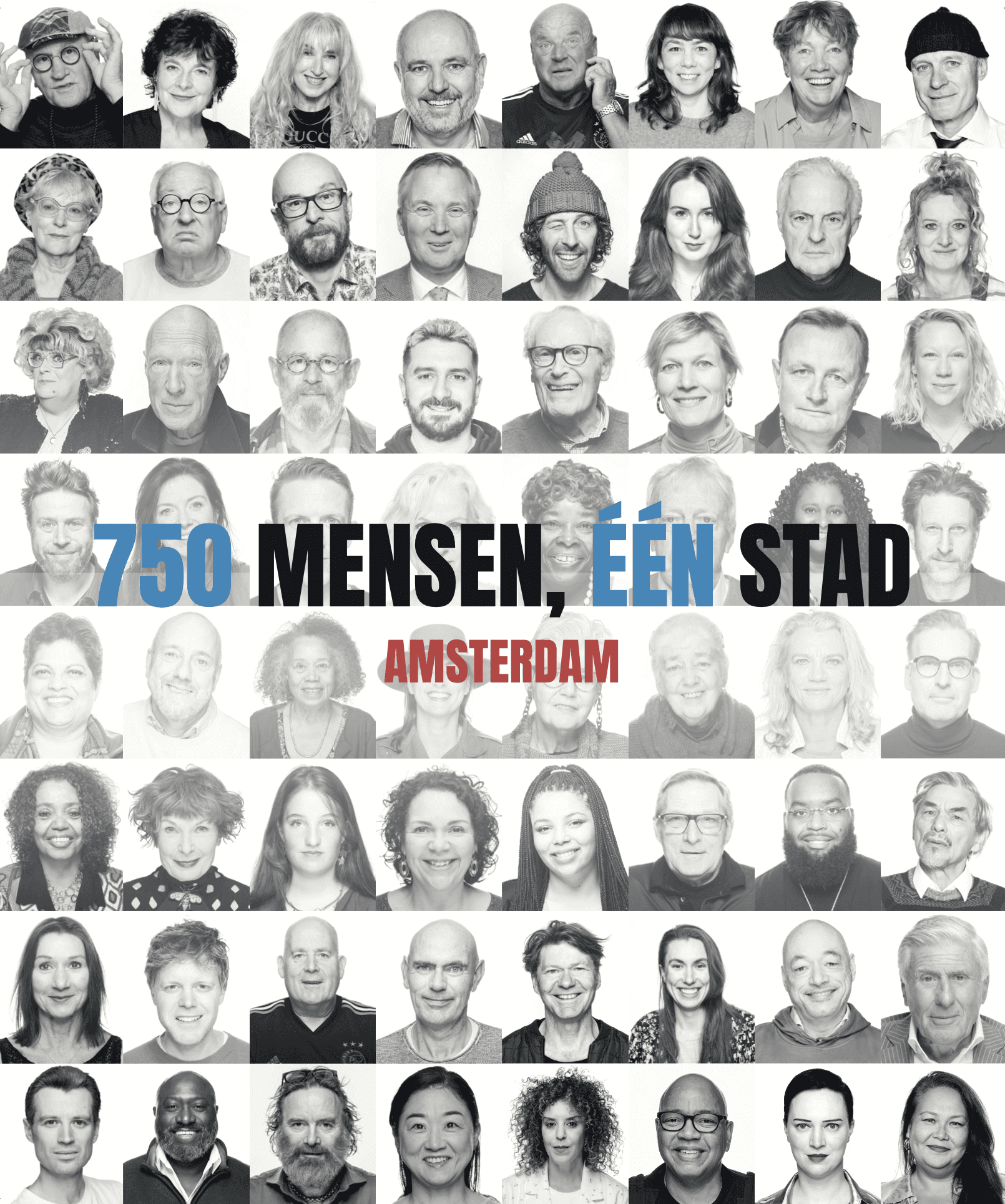
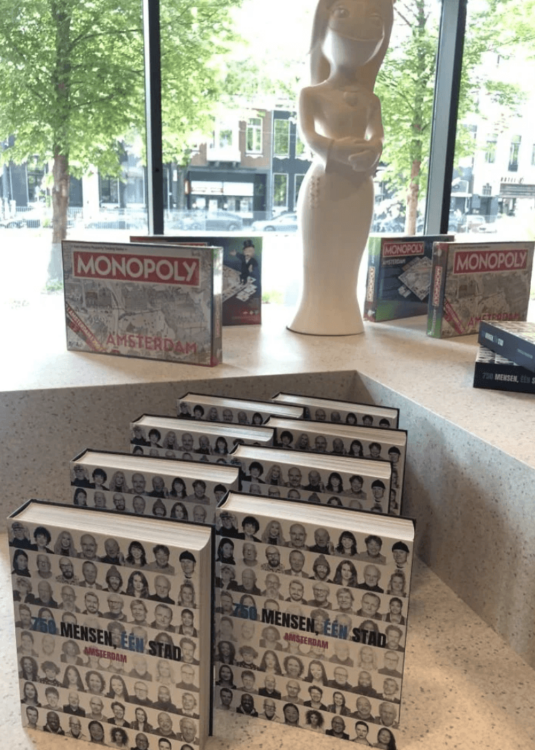
Eventually, the idea of a mosaic cover showing all 750 participants resonated most. Building on this, I proposed a mosaic composed of a mix of well-known and lesser-known Amsterdammers. This combination was designed to spark both curiosity and excitement, and that became the final cover.

Deliver
Preparing the final file for the printing company
After months of sharing PDF proofs, refining the design structure across pages, and editing quotes and photographs, the book was complete. A test file was submitted to the printing company, which revealed an error in the page numbering. This was swiftly corrected and by staying in close contact with the printing company, the final book was successfully printed.
The book went on sale at Amsterdam’s leading bookshops, including Scheltema and Athenaeum.


The exhibition at De Nederlandsche Bank
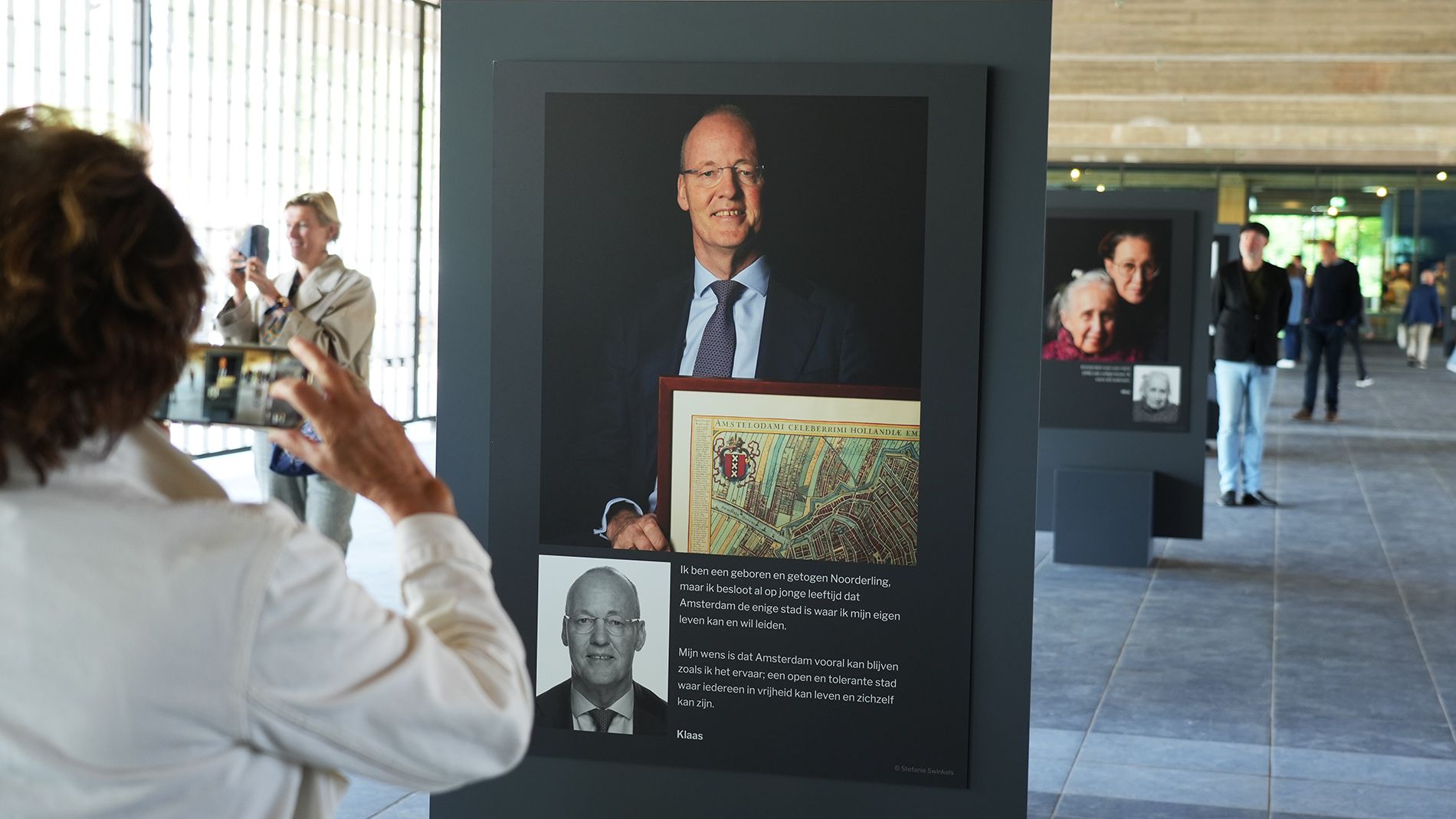
The photographers asked me to design the exhibition boards. I received the list of selected participants along with their personal quotes. Knowing the venue’s pillars would be dark blue, I worked to scale to ensure the boards complemented them perfectly.
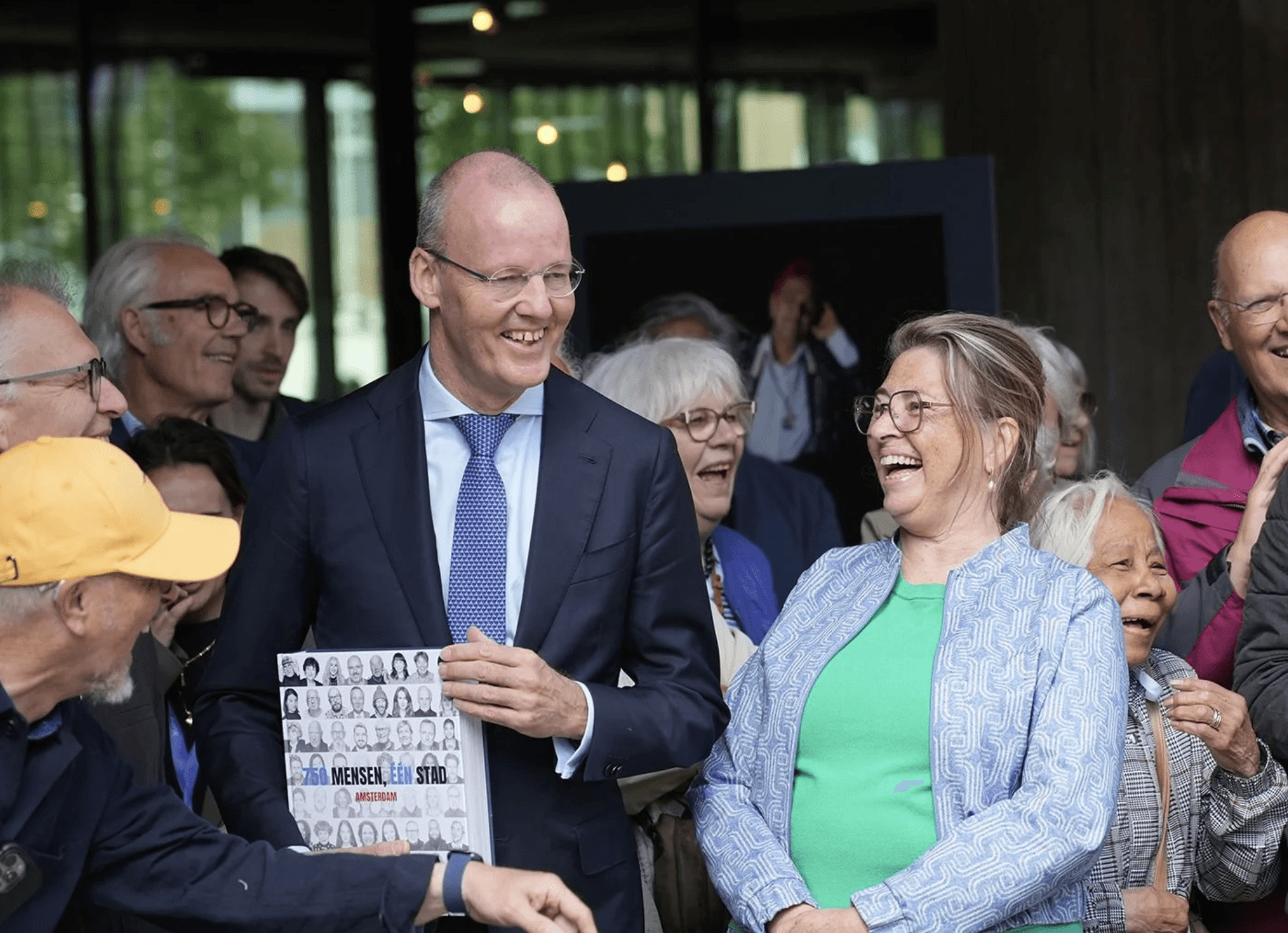
During the book and exhibition launch, the first copy was presented to Klaas Knot, former president of De Nederlandsche Bank.

Boosting book sales through the website
To further drive book sales, the website was launched to share personal stories about the people featured in the book. It was a way to connect the public with the Amsterdammers who had been photographed and bring the book to life beyond its pages.
Take a look!
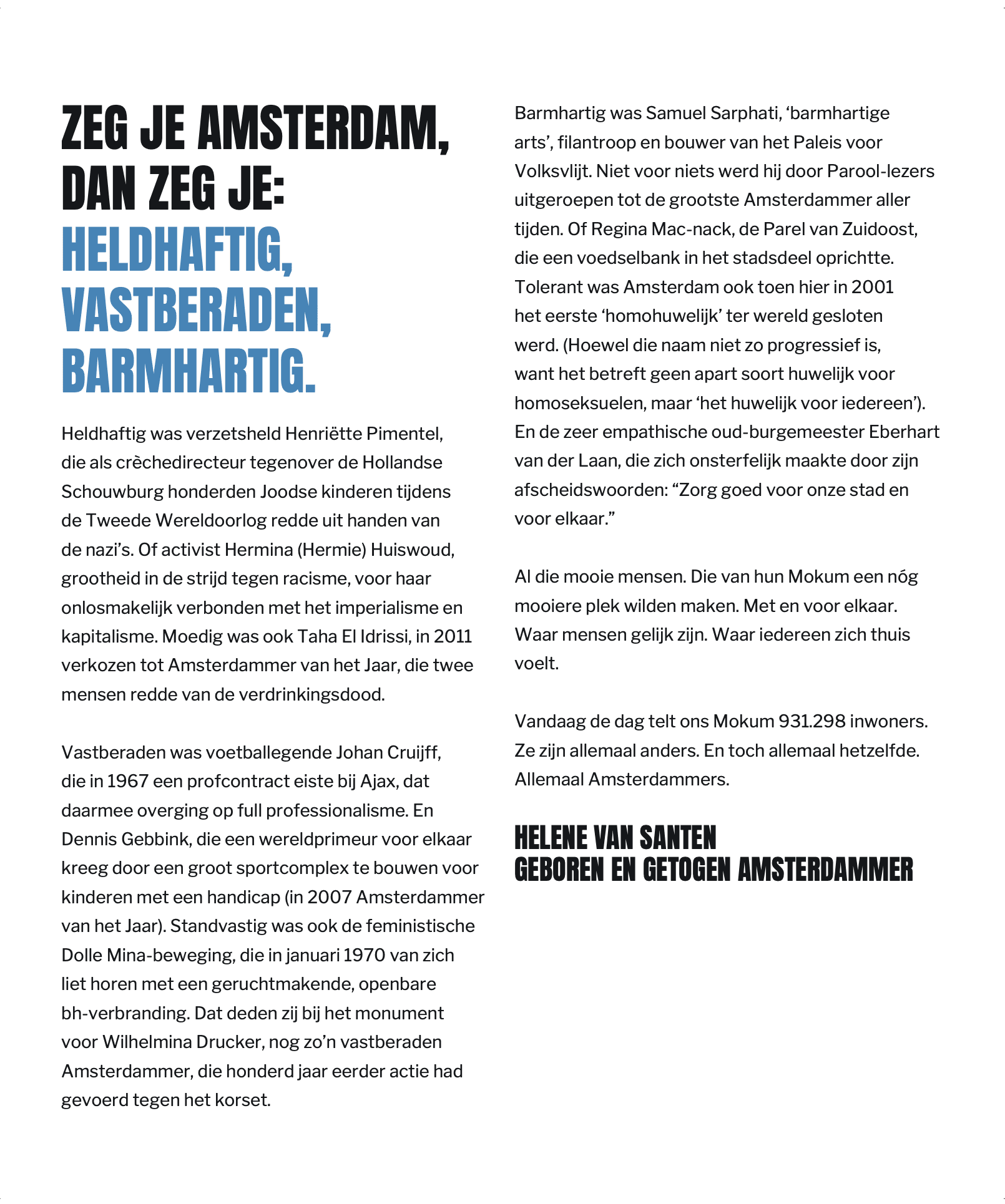
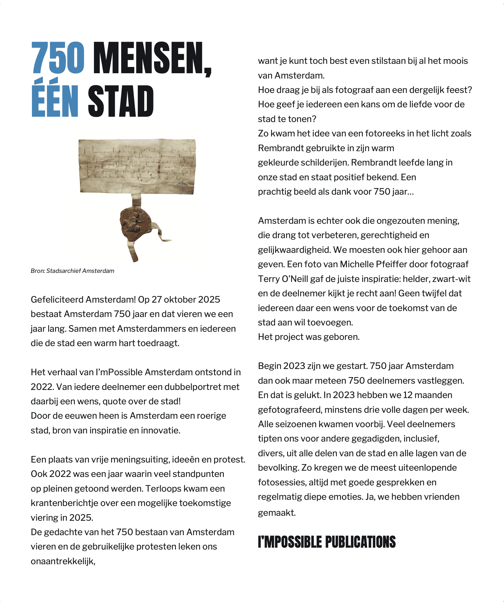
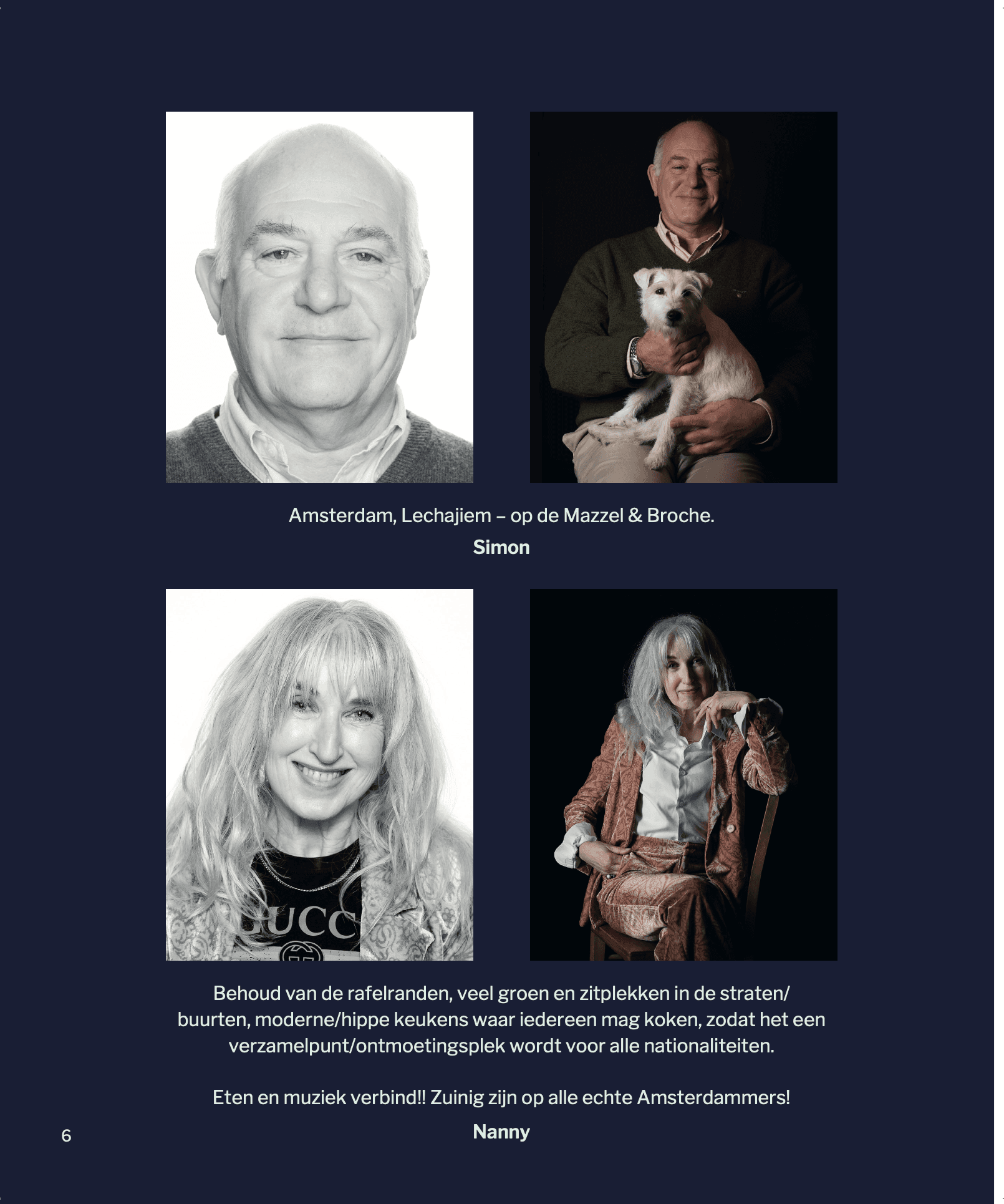
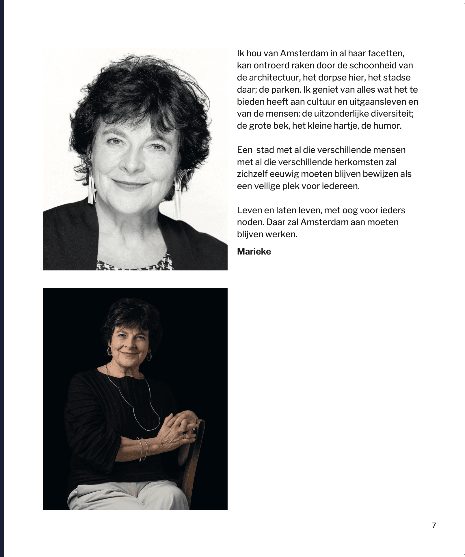
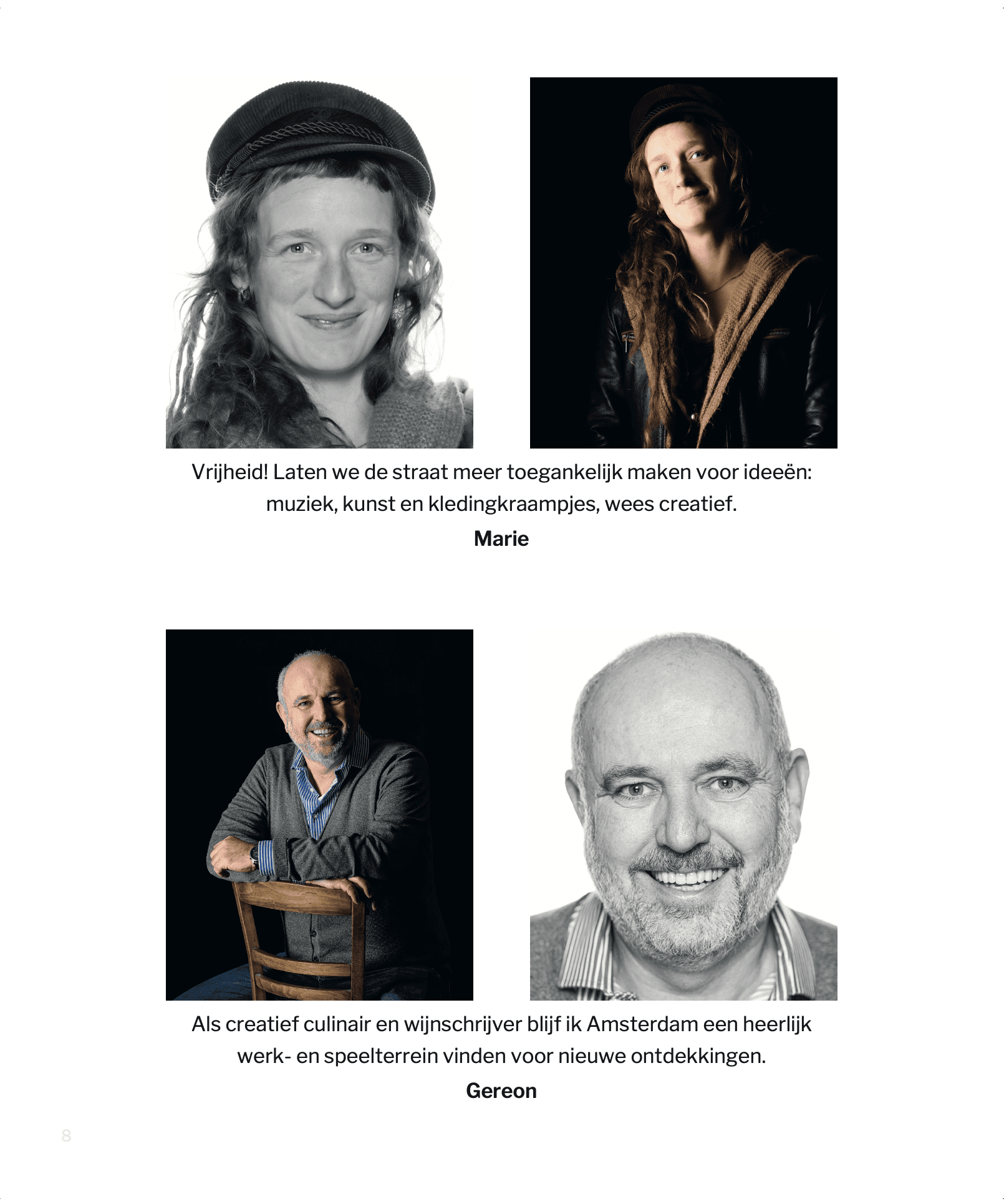
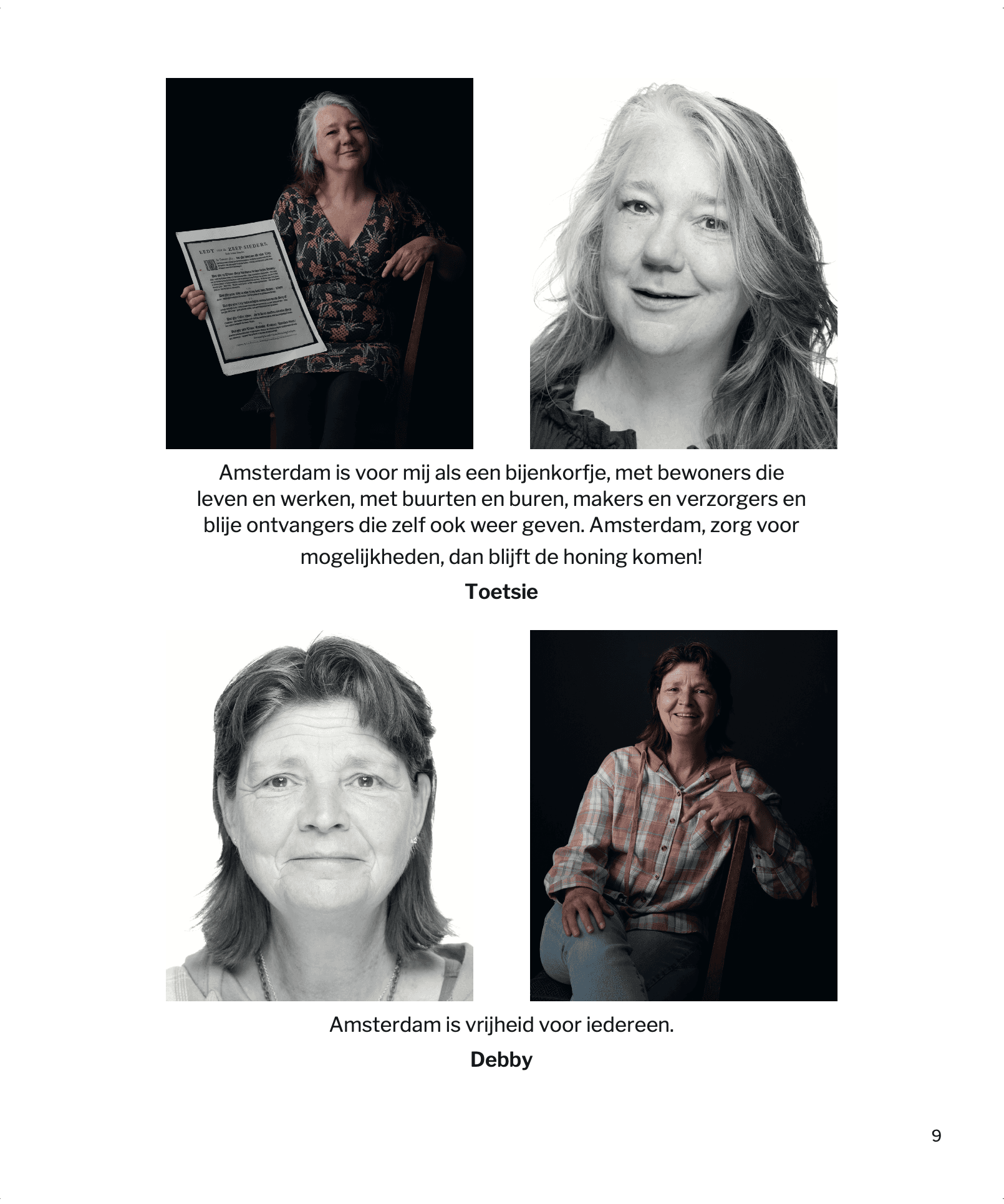
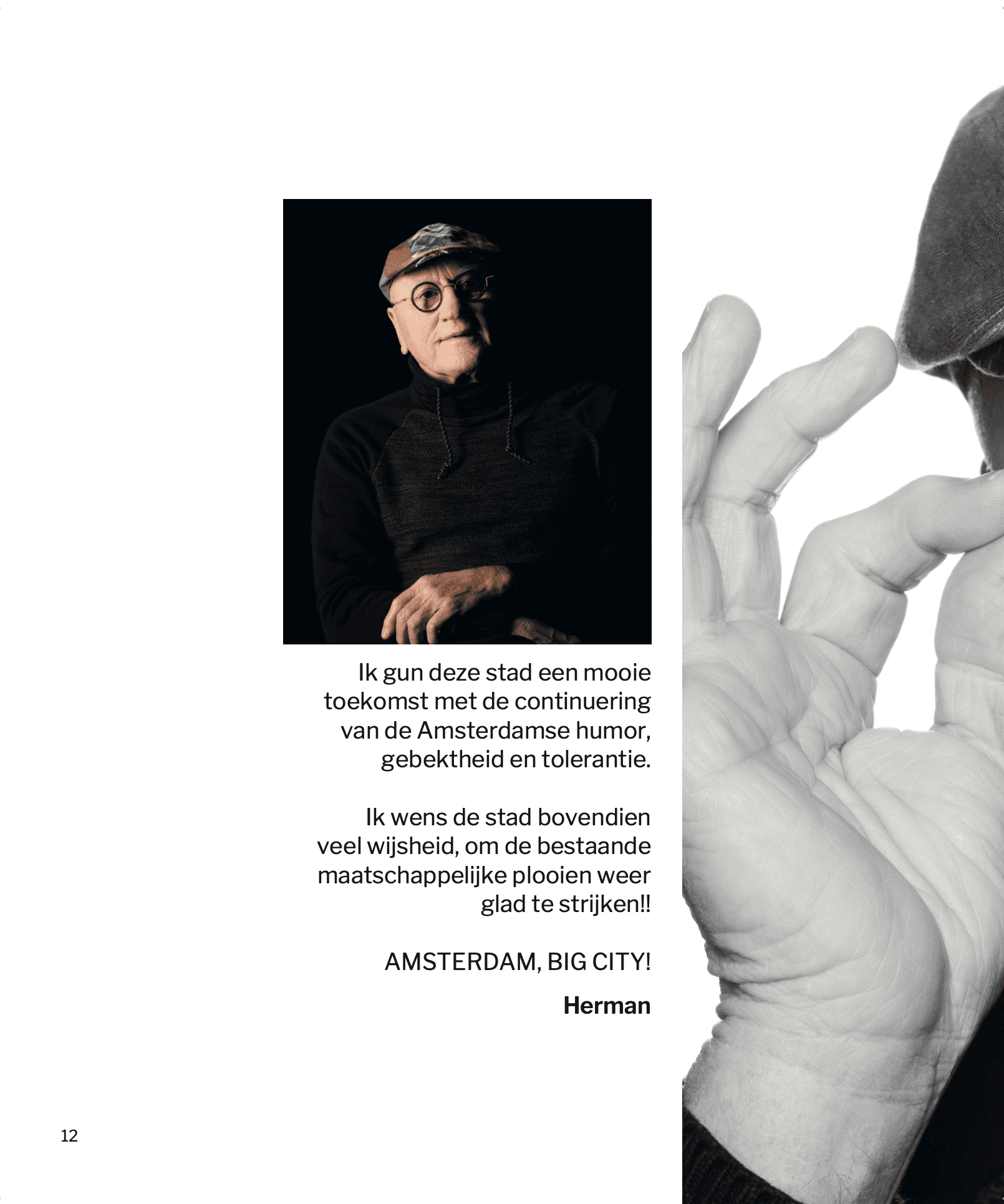
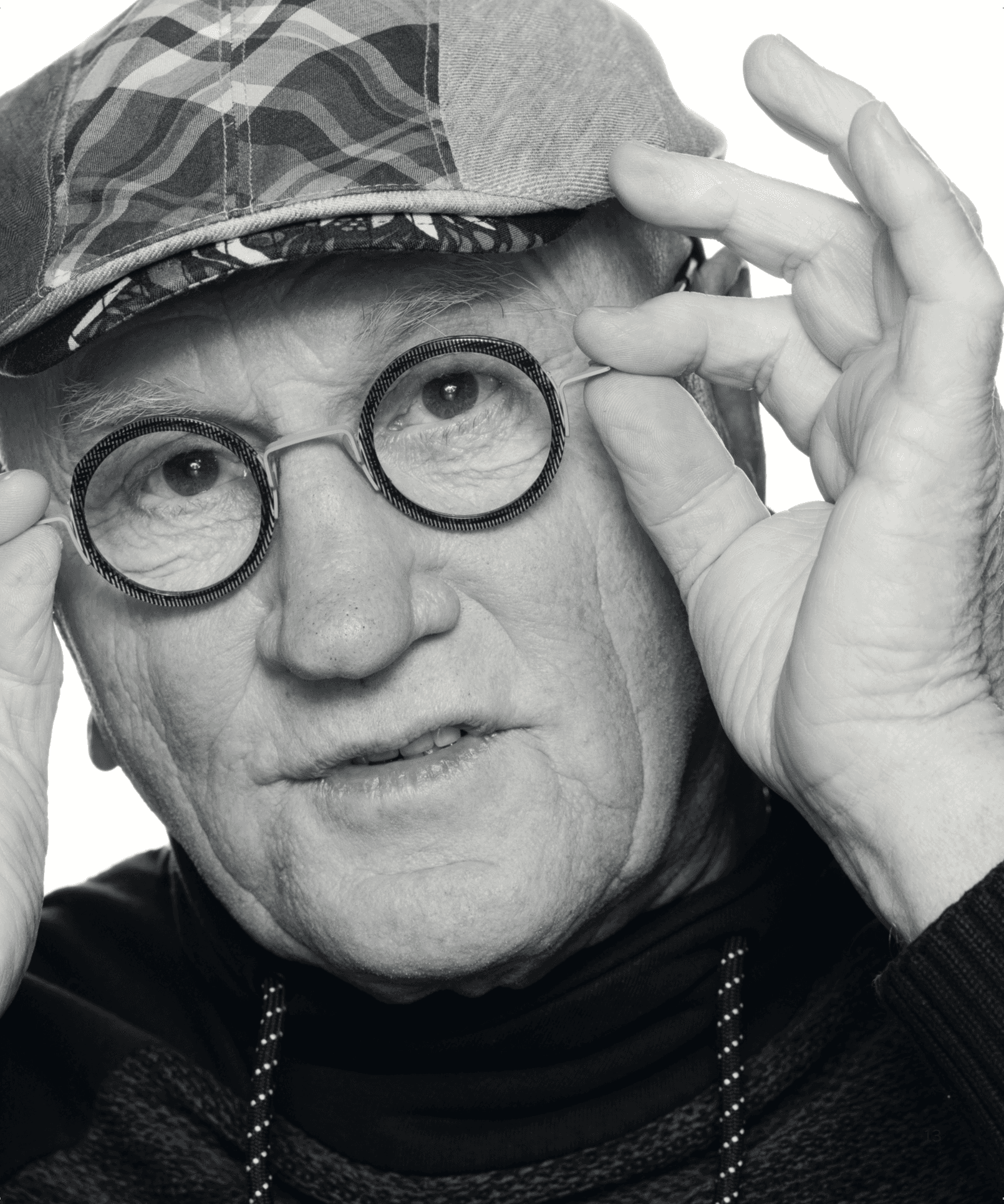
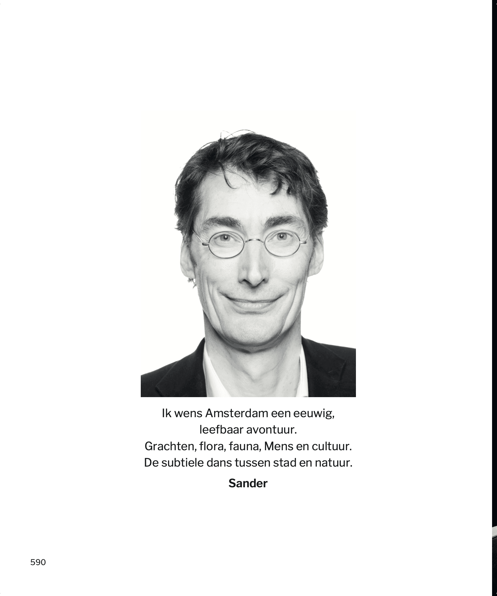
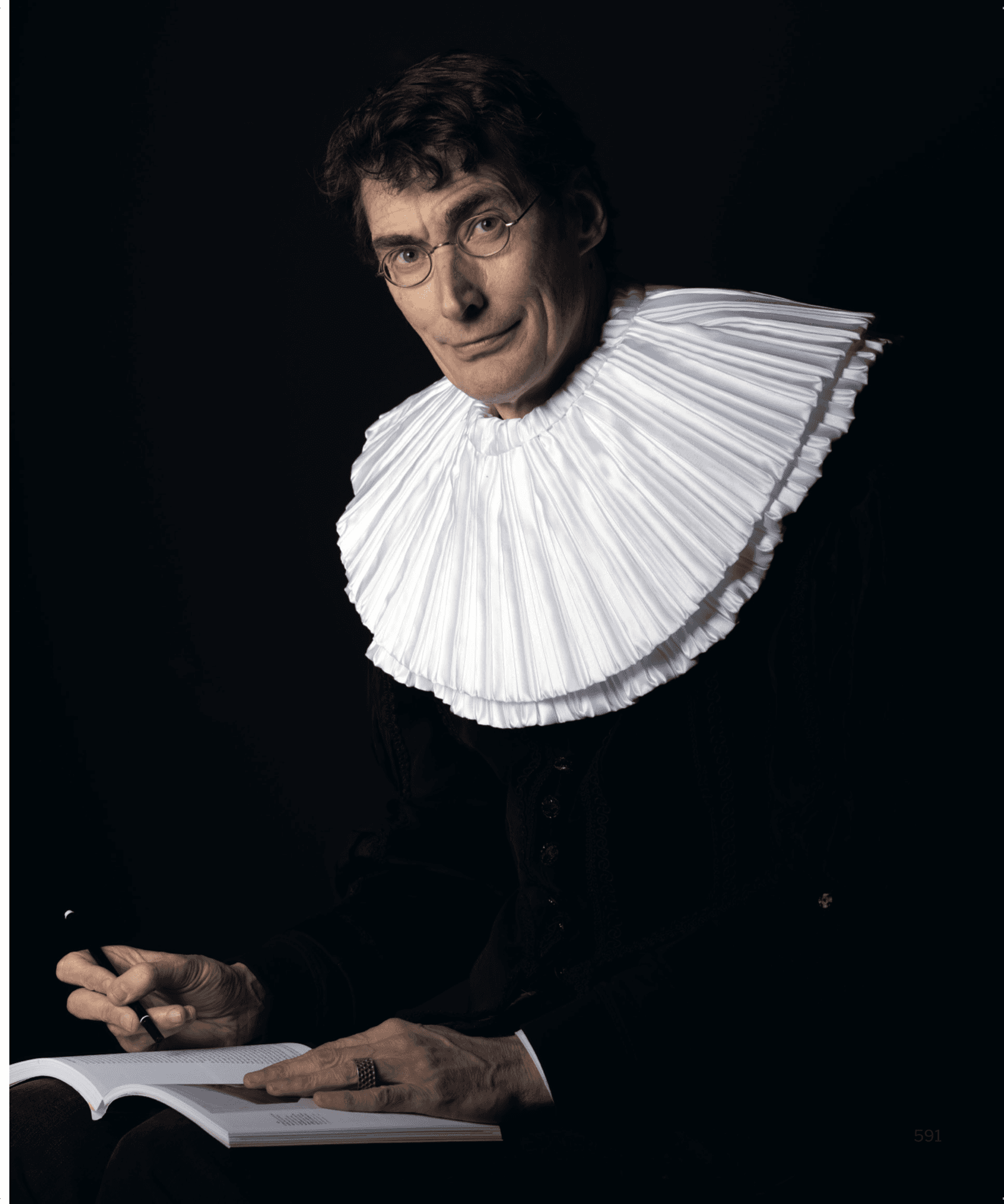
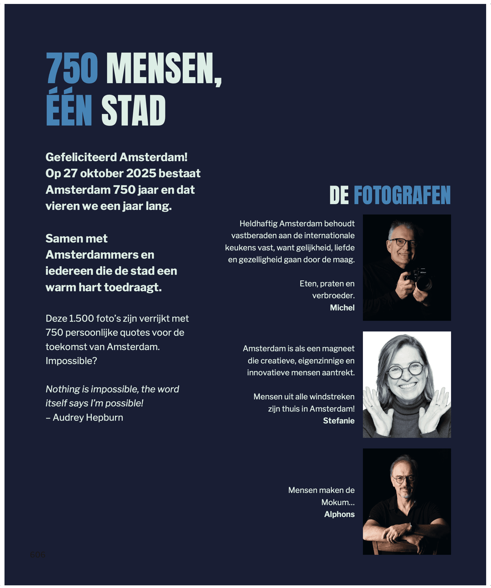
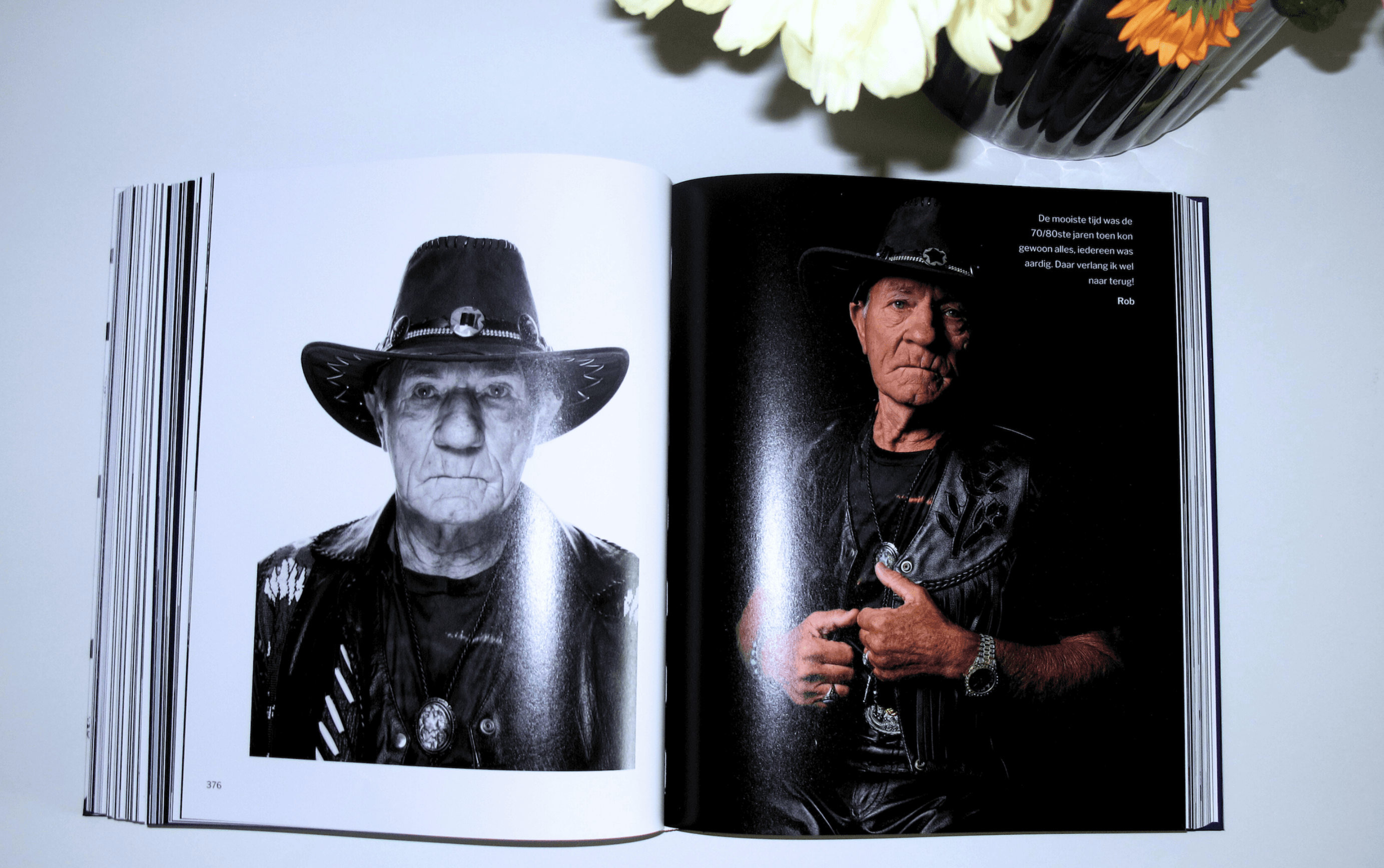
Shots of the project
Credits
Concluding Thoughts
During the project, challenging deadlines arose and difficult decisions sometimes had to be made. By remaining calm and providing the team with a sense of stability, I ensured a positive and productive working atmosphere.
A solution-oriented mindset is always central to my approach. Meeting deadlines, acting professionally, and proactively seeking new opportunities are second nature to me. An open and approachable attitude helps to foster relaxed and constructive collaboration.
My goal as a professional is to give clients confidence in my expertise, and in doing so, strengthen my own confidence.
Services
Graphic Design
Project Manager
Digital Design
UI/UX Design
Exhibition Design
Tools
Adobe InDesign
Figma
Miro
Notion
team
Clients
Michel Bouquet
Stefanie Swinkels
Alphons Nieuwenhuis
Designer
Tyneisha van Veltum
Publication
I'mPossbile Publications
Printing Company
Antilope de Bie
Editors
Stefanie Swinkels
Michel Bouquet